Read transcript
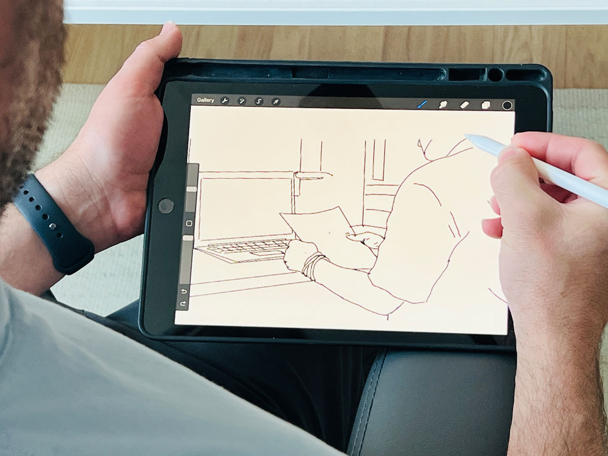
You know that feeling when you're trying to explain something complex, maybe how someone navigates a tricky app feature or just some convoluted internal process. Oh, yeah. And it just feels like wading through molasses, like the info's there, but getting a clear picture. Almost impossible. Totally. And that's exactly what we're tackling in this deep dive. Right. We're zeroing in on storyboarding, which sounds simple, but it's this surprisingly powerful way to make those foggy flows crystal clear. Exactly. And we've pulled together some really insightful material here. It looks at storyboarding from, well, pretty much every angle. Like it's history. Yeah. It's origins, which are pretty fascinating. Yeah. How it's used now in UX and product design. And crucially, why it's such a sharp tool for building better stuff for users. Okay. Let's unpack this then. Sounds like our sources cover a lot of ground. They really do. We'll nail down the core idea, figure out where it fits best in the design journey, look at the real strategic muscle it offers. And the results you can actually expect to see. Definitely. Plus the different types, how it works with other design methods, maybe some potential banana peels to avoid. Ha ha. Okay. Pitfalls. Right. Pitfalls. Right. And some practical ways and tools to actually do it. We even have a great story about how it helped a project that was completely stuck. Oh, I want to hear that. Yeah. It's a good one. I think what's really interesting is how storyboarding acts like this secret weapon against abstract ideas. You know? I thought so. It just instantly makes fuzzy concepts tangible. It brings the human element into the data. It's like a bridge for understanding. So our mission today, give people a really sharp understanding of what storyboarding is. Exactly. And why it's a skill that pays off. We want to show you how these visual stories can spark those aha moments way faster than digging through dense documents. Okay. Let's cut to the chase then. What is storyboarding in plain English when we talk UX and product design? Think of it like making a mini movie or maybe a comic strip. It's how someone uses your app or website. A visual sequence. Yeah. A visual sequence laid out step-by-step showing how a user interacts with something to, you know, get something done, achieve a goal. Okay. So it's more than just making things look nice. What are the essential bits, the must-haves for a useful storyboard? Good question. You absolutely need a specific scenario. And this usually focuses on a particular user, right? Often one of your personas. Makes sense. The who. Exactly. Then you need the visuals. These can be super quick sketches, stick figures even, or photos, maybe more polished illustrations later on. They show the user at each key point. And captions. Crucially, yes. Each visual needs a short, punchy caption. What's happening? What's the context? Maybe even what the user is thinking or feeling. Keep it brief. Right. Now, why visualize it? Why not just write out the steps? Seems faster. Well, our brains are just wired differently. We process visuals incredibly fast. Much faster than text. Okay. And we remember them better. So storyboarding taps right into that. It's like a shortcut to understanding complex flows. Instead of reading steps and trying to piece it together mentally. You just see it. Exactly. You see the whole thing laid out. Instantly makes more sense. Okay. Can you give us a super simple example? Make it concrete. Sure. Let's say a user wants to order a pizza online. Simple scenario. Classic. A basic storyboard might just have three panels. Panel one. User looking at a pizza site on their tablet. Maybe a thought bubble. Pizza night. Caption. User browses options. Okay. Panel two. Close up on the screen. Pepperoni pizza added to cart. Caption. Selects pizza. Adds to order. Panel three. Happy user on the couch. Pizza box open. Tablet shows. Confirmed. Caption. Enjoys pizza after successful order. Simple. Clear. Tells the story. I get it. Right. You instantly understand the flow. Okay. That clicks. So thinking about the actual design process, where does storyboarding really shine? When should you grab that pen or, you know, open that app? It's surprisingly flexible, but yeah, it's particularly powerful at a few key points. One is right after your initial research. The discovery phase. After interviews, surveys, that kind of thing. Exactly. You get all this raw data. Students can take those findings, user quotes, pain points, analytics, and turn them into relatable stories. So it sort of supercharges the data. That's a great way to put it. It makes the core themes jump out. Like if usability tests show people stumbling during signup, you storyboard that struggle. Makes it real. Makes the data human, relatable. Precisely. It shows the impact on a real person. Then later, when you're brainstorming, ideation phase. Throwing around feature ideas. Yeah. When a whiteboard scribbles on a whiteboard, even her gold. They let the team rapidly visualize how a new feature might actually work in a real scenario. Like mini prototypes. Kind of. IDEO calls them quick, low-resolution prototypes. That's the idea. Focuses on speed, exploring possibilities, not getting bogged down in pretty pictures. Low fidelity is key early on. Makes total sense. Fail fast, but with pictures. Got it. What about when you have too many ideas? How does it help prioritize? Ah, yeah. It becomes a great prioritization tool. When you visually map out the whole user journey, you can often spot the really critical steps. Or where users are hitting roadblocks. Like finding the bottlenecks. Exactly. Nielsen Norman Group had this example. Storyboarding a login flaw. The team realized clear progress feedback was way more important to users than, say, auto-fill. How'd they figure that out? Seeing the user's frustration visually in the storyboard, like, where am I in this process, wasn't really the priority obvious. Seeing the whole flow gets everyone on the same page about what to build first. Interesting. So it helps make smarter decisions, not just visualize. What about later, when you're actually building wireframes or prototypes? Still super useful. Storyboards help everyone keep the big picture of the user's actual journey in mind. Even when you're deep in the details of one screen. Provides context. Crucial context. It rinds the team how all the pieces fit together from the user's point of view. Some tools even let you link storyboard panels to UI mockups, like Indigo Studio. Oh, cool. Yeah. So if the UI changes, you can update the storyboard more easily. It keeps the design user-centered as it gets more complex. And what about explaining things to, well, people who aren't designers, stakeholders? Oh, fantastic for that. They turn abstract UX stuff into something tangible for other departments. A simple comic strip of a user scenario builds empathy way faster than a spec doc. Shows a why. Exactly. Instead of saying, checkout conversion is low, you show a visual of a frustrated user abandoning their cart. Much more powerful for explaining why a feature matters and how it's supposed to work. Okay, so it sounds like storyboarding packs some serious strategic punch. Let's dive deeper into those advantages. Why should teams really bother making this part of their workflow? Well, one of the biggest wins is just dramatically better communication and alignment. It's huge. How so? Visuals usually tell the user's story. Everyone, designers, devs, PMs, marketing, whoever, can see the vision together. Visuals are just more memorable, right? They grab attention better than text. The Interaction Design Foundation points out how they create this shared understanding. Makes it easier for everyone, even non-technical folks, to grasp the intended experience. Really cuts through the ambiguity. A picture's worth a thousand meetings maybe? Yeah, something like that, absolutely. And another big thing. It forces a user-centered focus. And builds empathy. How does it force it? By making the user the main character. You have to think from their perspective. You're designing their journey, considering their needs, their feelings. Seeing that visually, their potential frustrations, their successes, makes it much more relatable for the whole team. Like a built-in empathy generator. Exactly. The UX Institute notes how it helps even non-designers empathize just by seeing what the user sees and goes through. It's like visually walking in their shoes. Okay, that's powerful. What else? Well, because it's relatively quick, especially early on with sketches, it allows for early problem discovery. Finding issues before coding. Right. You can essentially prototype flows with sketches before sinking tons of time and money into detailed designs or development. This visual check can reveal plot holes, you know, or missed scenarios. Things that would be costly to fix later. It saves time and money basically, avoids dead ends. Definitely. You explore ideas and gauge their potential much more effectively. And related to the communication point, it really helps with stakeholder buy-in. Because it's visual. Yeah. A visual story is often way more persuasive than a list of requirements. When stakeholders can see the journey and understand the why behind a feature, it's easier to get their support. Any examples of companies doing that? Airbnb is famous for using storyboards as a key benchmark to keep everyone aligned on guest and host experiences across the whole company. Interesting. And finally, it helps with prioritization and vision. By showing the user's context and unmet needs visually, like that missing progress indicator example, storyboards make a stronger case for why certain features are crucial. Keeps the vision user-centered. Okay, so if teams actually use storyboarding effectively, what are the concrete results? The tangible outcomes? Well, first off, much clearer shared understanding of the user flow. The storyboard acts as a visual reference point. Reduces misunderstandings a lot. A common language. Exactly. Everyone's looking at the same picture when they talk about features. Cuts down on confusion. Smooths out friction. What else? It actively helps find pain points and opportunities. Stepping through visually makes it easier to spot where users might hesitate, get confused, or hit a wall. Problems become visible. And that sparks ideas for fixes. Often, yes. And it helps align priorities. Seeing the whole journey laid out helps teams make better calls on which features deliver the most user value. Where to focus first. And what about the softer stuff? Like team empathy. Critical. A good storyboard really boosts empathy. Seeing a user struggle visually hits harder than reading a report line. It reminds everyone they're designing for real people. Like you said, human. Totally. And ultimately, that leads to better, more user-centered design. You're more likely to build things that actually solve user problems and create a positive experience. Like Airbnb says, it makes user experience a company problem, not just a design team thing. Right. OK. We're sold on the why. Let's get practical with the how. What different types of storyboards are out there? It sounds like it's not just one thing. You're spot on. They come in different flavors. Yeah. The main differences are usually level of detail, visual style, and maybe the narrative focus. OK. Like detail level. Yeah. Fidelity. Fidelity. Yeah. Early on, lo-fi sketches, stick figures, simple shapes are often perfect. Because they're fast. Fast. Yes. But also, the roughness is a feature. They look unfinished, so people give more honest feedback. They don't feel precious. You explore ideas without getting hung up on visuals. And high fidelity. More polished, detailed illustrations. Often digital. Take longer. Better for, say, client presentations or when you need that refined look. But remember, clarity always beats artistic skill. The choice depends on the purpose and the audience. Makes sense. Speed versus polish. What about visual styles? You see traditional storyboards, classic comic strip format, hand-drawn panels, captions. Still popular because it's fast, flexible. Anyone can do it. Pen and paper. Exactly. Then there are digital storyboards. Yeah. Made with software. Can have color, icons, maybe basic animation. More polished look. Easy to reuse assets. Easy to share online. Good for presentations. And you mentioned thumbnail storyboards. Yeah. Those are super quick. Really rough. Tiny sketches. Fantastic for rapid brainstorming. You can bang out dozens of ideas on one page. Pure idea generation. So traditional for speed. Digital for polish. Thumbnail for brainstorming. Got it. What about the story itself? Different narrative approaches. Some people distinguish between narrative storyboards telling a full story. Beginning, middle, end, and scenario-based ones focused on a specific task. Like reset password. Exactly. For UX, they often blend. Most UX storyboards are built around a scenario, but they still tell a mini-narrative of that interaction. You might use a purely narrative one in research, maybe to gauge reactions to a broader concept. But mostly, the scenario drives the story in UX. You pick the style and detail that tells that story best. Okay. So storyboards don't live in a vacuum. How do they play nice with other UX tools? Journey maps? Wireframes? Crucial point. They work best when integrated. Take journey maps. They give you the big picture, right? All the user touch points, the emotional ups and downs. The 30,000-foot view. Right. Storyboards then zoom in on specific critical moments within that journey. They add the visual details. The journey map might say, user tries to check out, but the storyboard shows the user interacting with the screen, maybe hitting a confusing form field, feeling frustrated. So map is broad, storyboard is focused, and visual. Exactly. Journey maps are often broader, maybe more text-heavy. Storyboards are graphical, zoomed in. Okay. So what about wireframes and prototypes? Where do storyboards fit there? They usually come before wireframes. The storyboard defines the flow, the why. Wireframes detail the what the screen layout, the elements. So story first, then screen details. Generally, yeah. You might sketch the storyboard for a task flow, then create wireframes for each screen in that flow. And like we said, some tools link them. Helps ensure your detailed screens don't lose sight of the overall user journey and intent. Keeps you user-centered as you add fidelity. And what about personas and scenarios? They seem fundamental. Absolutely foundational. Storyboards must be rooted in your personas and scenarios. Often the persona is identified right on the storyboard panel, along with the scenario. Persona is the main character. Exactly. Persona is the star. Scenario is the plot they're navigating. The typical flow is write the scenario, who, what goal, what context, then visualize it as a storyboard. Ensures design is grounded in real user needs. Makes sense. And as you get closer to a working product, do they still have a role? Definitely. As you build prototypes, storyboards are a constant reminder of the intended narrative. You reference them to check if the prototype reflects the desired flow. Keep things on track. Right. You can even tie prototype screens back to storyboard panels. And when presenting or testing, walking people through the storyboard first gives crucial context before they dive into the interactive prototype. Sets expectations. Useful for agile teams too. Yeah, they can be like a visual table of contents for sprint features. A quick, user-centric summary of what's being built. This all sounds incredibly useful, but surely there are ways to mess it up. Common traps or pitfalls? Oh, for sure. Definitely pitfalls. One is getting the detail level wrong. Either too much overwhelming people or too little, leaving out crucial context. Finding that sweet spot is key. Simplicity, but clarity. Right. Another big one. Forgetting the user. It's easy to drift into focusing on technical details or the designer's process. It has to stay focused on the user's experience, their perspective. Avoid jargon. Avoid assumptions. Keep it user-centered. Got it. What else? Grounded in research. Don't just storyboard the happy path. Show the problems, the frustrations, the edge cases, based on actual evidence, if you have it. If it's hypothetical, treat it like a hypothesis to test. Don't cherry-pick. Exactly. And keep them current. Designs evolve. Storyboards need to be reviewed and updated, otherwise they become useless, even misleading. The analog ones are especially vulnerable here. Static storyboards, bad. Pretty much. And be mindful of time. High-fidelity ones can take a while. Use that level judiciously. Remember, the value is in the thinking, the user focus, not perfect art. IDEO emphasizes that. Thinking over artistry. Right. And finally, don't treat them as gospel. Get user feedback. Validate your assumptions. Iterate. They aren't the final word. Okay, super helpful warning. So how do people actually do this? What are some recommended tools or methods to get started? Lots of options, really. The simplest is analog. Pen and paper, whiteboards, sticky notes, templates can help keep things consistent. Great for quick sketching, brainstorming, collaborative sketchboarding sessions are really effective. Low-tech, high-speed. Exactly. Then you've got digital whiteboards, Miro, Mural, or even design tools like Figma, PowerPoint. Great for remote teams, easier editing, sharing. What about specialized tools? Yeah, there are dedicated storyboard apps like Storyboarder or Boards. They often have asset libraries, panel grids, annotation tools. Some handle basic animation. Good for more polished outputs. If you need that polish. That's right. And remember, your main design tools, XD, Figma, Sketch, can absolutely be used for storyboarding. Just sequence your artboards. Some tools integrate storyboarding with prototyping more tightly. And methods, like design sprints. Definitely. Storyboarding is a core part of things like Google Ventures Design Sprint, IDEO's human-centered design toolkit. These frameworks show you when and how to use it effectively in a structured process. So plenty of resources and examples out there. Tons. Templates from Nielsen Norman, case studies. Looking at examples is a great way to learn. You mentioned a real-world story earlier, the Stalled Project. Ah, yes. Chris Mullen's story. Yeah. Really shows the impact. He joined a project stuck for months, right? Minimal progress. Yeah. What'd he do? Super quick discovery. Brief, focused interviews with key stakeholders, just understanding their daily pains. Unmet needs. How quick. Less than a day. He synthesized the insights, aligned them with business goals, and boom, identified about a dozen potential feature opportunities tied directly to those user frustrations. Wow. And then storyboards. Immediately. Simple storyboards for each potential feature. The goal. The whole team easily visualize, assess, and prioritize what would actually deliver value. So the storyboards were for the team's decision-making. Exactly. He expected focused feedback, informed decisions, and finally, a clear direction after months of struggling. It's just basic best practice, really, but it made a huge difference. Sometimes the simple things work wonders. That's a fantastic example of cutting through the fog. Now storyboarding itself, it's been around a while, right? Where did it actually start? Oh, yeah. It has some history. Storyboarding itself. Storyboard. Pretty literal story plus board. It was formalized back in the 1930s, Walt Disney Studios. Disney. Makes sense for animation. Totally. For films like Three Little Pigs, they started pinning sequential drawings onto boards to pre-visualize scenes, plan the pacing before animation. Hugely influential. So they invented it. They formalized the systematic approach that became the standard. It quickly spread to live-action film, advertising, and now, as we've seen, way beyond entertainment into software, UX, service design, visualizing experiences and workflows. Cool. So can you trace that evolution? How did it get from Disney cartoons to UX design? Sure. So 30s to 50s. Film and animation, purpose, planned scenes, efficient storytelling, reduced risk, ghouls, illustrated panels. Then advertising. 50s to 70s. Yeah. Ads and marketing, pick it up. Purpose shifts to pitching concepts to clients. Selling ideas visually with emotion becomes more client-facing. Then software. 80s and 90s. Yeah. Software and HCI emerge. UX starts taking shape. Storyboards used for things like paper prototypes, visualizing screen transitions, personas start appearing too, adding that user focus. When did it become mainstream UX? Really the 2000s, 2010s. Big influence from design thinking, IDEO. Focus expands to end-to-end journeys, user emotions, context. Huge emphasis on empathy, accessibility. Digital tools take over from hand drawing. And now? Today? Today. Today. Today. Core part of Agile, lean UX. Used broadly in service design, customer experience, not just digital products. Integrated with other tools. Still fundamentally about visualizing problems, communicating intent clearly. And Chris Mullins' story fits right in. Perfectly. Shows its modern value. Aligning teams on user context, making abstract ideas tangible, encouraging collaboration, enabling faster iteration. The core benefits haven't really changed, just the application and tools. Wow. Quite the journey. Okay. Let's bring it all together for everyone listening. What's the absolute key takeaway storyboarding today? The core thing is this. It's an incredibly powerful, really versatile visual way to deeply understand and clearly communicate user experiences. Simple as that. Powerful, versatile visual. Right. It turns abstract ideas into something real. It builds shared understanding, fosters empathy across teams. And ultimately, it leads to better products, more user-centered products, and smarter decisions. Because it keeps the focus squarely on the user and their journey. And crucially… Crucially, it's about clarity and user focus, not about being a great artist. Anyone can do it effectively. Fantastic point. Okay. On that note, here's a little something for you, the listener, to chew on. Food for thought. Exactly. Think about some complex process in your work, maybe even your personal life. What if you took just five minutes to visualize it as a super simple storyboard? Few panels, quick sketches, brief notes. Could it reveal some insight, some area for improvement you hadn't seen before? Worth trying. Right. A quick mental experiment. Definitely. And like you said, this deep dive really just scratches the surface. Absolutely. We definitely encourage you to look into the tools, the templates we mentioned. Think about how you might apply storyboarding to your own challenges. It's incredibly adaptable. Agreed. Well, here's to the power of visual thinking and always, always keeping the user right at the heart of things.