In 30 seconds
01: The problem
The only record of what’s open is a clipboard at headquarters.
Green Ridge State Forest’s campsites are first-come. The only record of who is where is a paper sign-up sheet at headquarters, and the only way to read it is to drive there and stand in front of it. So the app had to be honest about something it can never know for sure: whether a site is still free when you arrive.
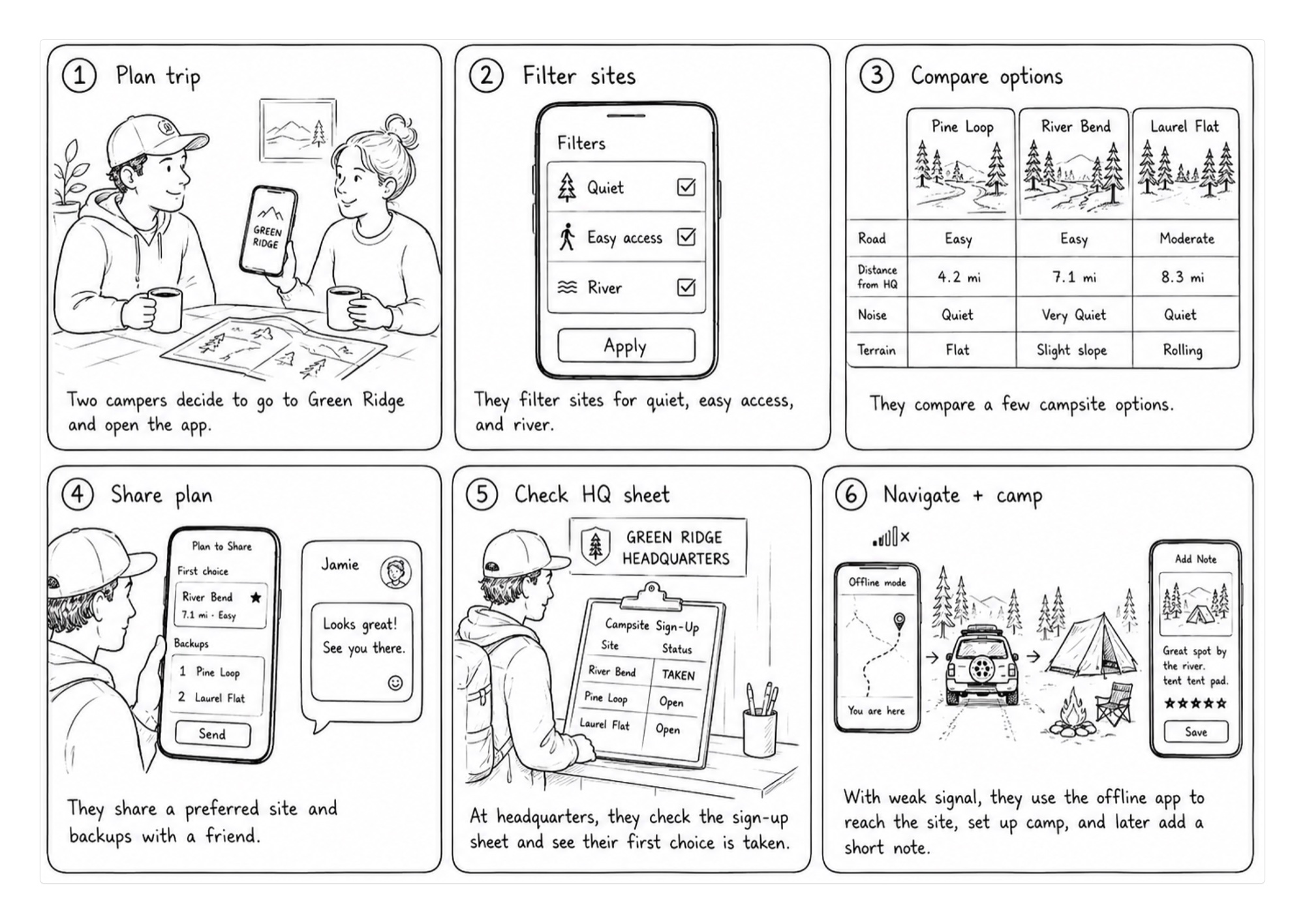
More: the brief, and the four tests that set the direction
The clipboard at headquarters is a single physical artifact. It lives inside one building, during posted hours, and it can only be read by someone standing in front of it. There is no digital backup, no historical record, and no way to query it remotely. If you want to know what’s open, you drive there.
Green Ridge doesn’t expose a reservation API: Maryland DNR runs the forest, and its first-come, first-served sign-up sheet at headquarters, staffed during limited hours, and the operational ground truth lives on the board itself. Campers want planning context (what kind of site is this?) and situational context (what did the board say recently?). A polished “availability” UI that pretends to be authoritative would erode trust faster than no app at all.
The design problem became: help people browse and compare sites honestly, surface freshness of clipboard-derived state, including when the last photo is too old to assert open or taken, and make contribution at HQ feel fast and cooperative, not extractive. Always confirm at headquarters; the app shows what’s likely taken before you drive out.
That constraint shaped every product decision that followed.
Each step started with a test, and two tests said the plan was wrong.
This is an active project, still shipping. It doesn’t run on a release calendar. It moves when a test comes back and says what to build next. Four of those tests set the direction this write-up describes, and two of them came back saying the plan was wrong.
Can vision read a handwritten roster?
Said: yes, unreliably. Built: the honesty layer before the accuracy layer. Freshness states, redaction, an archive.
Does anyone actually want this?
Said: 193 forum posts, counted and ranked. Availability first, water second, road access third. Built: that ranking, in order.
Should a different reader parse the sheet?
Said: a clean score on one sheet didn’t hold on real photos. Built: review for anything uncertain, and the one part of the alternative that held up.
Can any of it be found?
Said: every campsite URL was quietly returning the homepage. Built: 91 crawlable pages, and a smoke test that checks the premise instead of the status code.

01b: At the Kiosk
One photo of the sheet becomes a list of open sites.
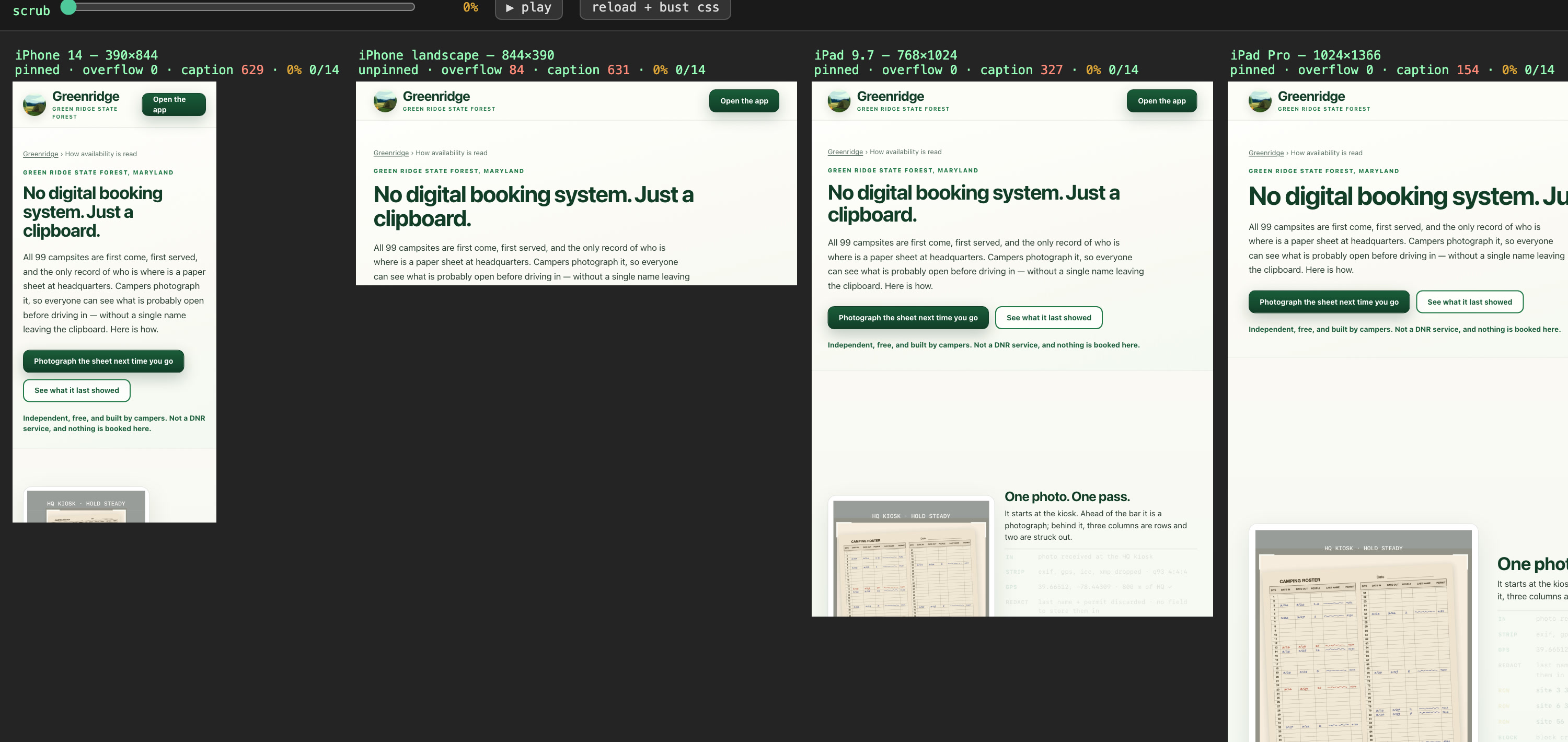
It starts at the kiosk. Ahead of the bar it is a photograph; behind it, three columns are rows and two are struck out.
Scroll drives it. The sheet is drawn for this page: every real one carries a column of campers’ surnames, so none is published here, but its structure, the twelve block boundaries and the steps are the pipeline’s own. No model runs in your browser, and the reader takes the twelve blocks in its own order rather than top to bottom.
02: The app
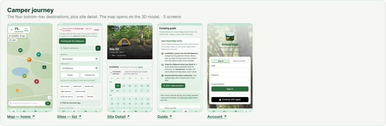
The forest, every site, and how old the news is, on one screen.
The map is the forest itself, built from the elevation model at true scale. Pick a site and it shows what the sheet said and how long ago, the sun and shade across the day, and the road in. It works with no signal, which out there is the normal condition.
More: the terrain model, offline, and DNR’s notices
The map became a 3D model of the forest.
A pin on a basemap answers where a site is. It does not answer the question a camper is actually asking, which is what the site is like: whether the pitch is flat, whether the ridge takes the sun off it at four, whether the road in is the one that washes out. The forest is now built from the USGS elevation model at true scale, with the roads, the river and the tree cover on it, and every site openable onto the ground it sits on. The terrain stopped being decoration the moment other features started asking it questions: the night-sky chart clips its horizon against this model, not against a flat sky.
One twin, two renderings, for a reason. The marketing site’s hero is this same map baked to a still image on a schedule, because the app is a client-rendered SPA that a crawler reads as an empty div. Mounting the live twin at the top of the page built to answer that problem would have repeated it. The bake satisfies static-first literally: a crawler gets a real picture of Green Ridge under the sky it actually has, and so does a visitor with JavaScript off. The hero at the top of this page is that same bake, twenty-four hourly frames run as one day.
Closures and burn bans stay in DNR’s words, with when they were checked
Closures, burn-ban status and the hunting season in progress are carried in DNR’s own words, each with its source and the time it was checked. That is the freshness chip again, pointed at an authority rather than at a clipboard: the app does not paraphrase a closure into something friendlier, and it does not present a notice without saying when it last looked. A product that would rather say less than guess wrong cannot make an exception for information it did not gather.
The product is most needed where the network is worst
The forest is a connectivity dead zone, which is not an edge case here but the ordinary condition: every campsite, the terrain, the map and the field guide stay on the phone, so the guide works in the hollows with no bars. Anything a camper adds waits and sends when they are back in range. Offline was a constraint from the first week rather than a feature added late, and it is the reason the architecture is boring on purpose everywhere it can afford to be.
None of these are new systems. The terrain was already there for the sky chart, the notice card is the freshness pattern with a different source, and offline is the storage layer the clipboard capture already needed. New doors, same house.
03: Reading the sheet
The model only reads the sheet. A person confirms what it isn’t sure of.
The vision layer doesn’t “guess reservations.” It turns a photo into structured rows; the server validates them, applies privacy rules, and sends anything uncertain to a person. Real photos are the reason: tested against every photo on file, no reader was right every time, so the app routes uncertain rows to review and says when it can’t confirm a site. The test is public: paperparse runs it in a browser, with no install.
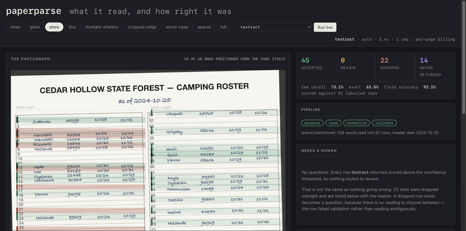
More: the pipeline step by step, the camper’s photo, the correction loop, and how the reading is tested
Multipart image
POST /api/sheet; Cognito-linked identity where required.
Validate bytes
Magic-byte check, strip/re-encode, dimension limits, optional preprocess before the model call.
Proximity check
EXIF GPS vs headquarters radius when present; skip when metadata doesn’t allow a fair check.
Structured JSON
Multimodal call returns rows, sites, dates: retries with backoff on bad output.
Schema + rules
Server schema validation; low confidence routes to pending review, not silent publish.
Redact + archive
Redacted public archive image; duplicate detection via content hash.
Human-in-the-loop: uncertain parses surface in admin review: trust is a workflow, not only a model score. Admin-validated snapshots feed back into the model as a curated training corpus.
Campers keep it current by photographing the sheet.
Before the map asks anything of a visitor, the product teaches the loop. A first-run welcome and the in-app Guide say it in camper language: first-come camping, availability from HQ clipboard photos, contribution that reads site numbers and stay dates only, never names, and a plain line that this is not a Maryland DNR product. Always confirm at headquarters.
Photography is the refresh mechanism. Someone standing at the board captures what it says so everyone else gets a more current picture, without anyone claiming a reservation. Two entry points reach the same pipeline: the in-app update-from-clipboard flow, and a standalone photo-clipboard landing for share campaigns. The freshness chip deep-links here once the last photo goes stale.
Field constraints shaped the copy and the server both. Wording favours “photo” over “scan,” layouts assume one hand on a phone, and the checks that run before a model sees the image are the ones holding up trust: byte and dimension validation, optional EXIF capture date, an HQ proximity check when the metadata allows a fair one.
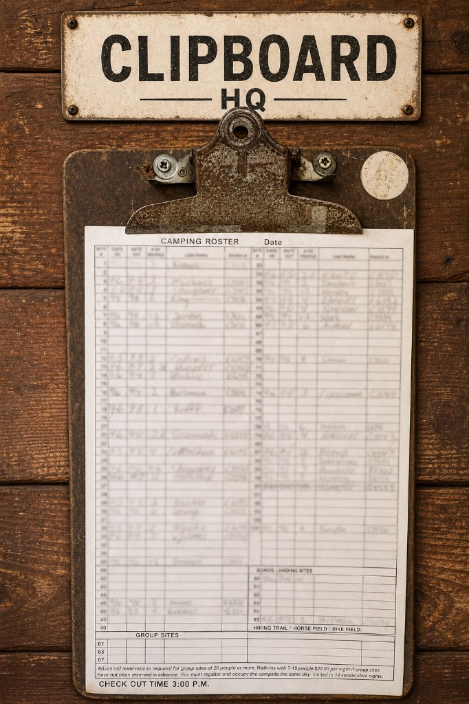
The operational artifact in the field: the product mirrors this object, not a reservation database. Tap the card to open the full clipboard photo flow.
Each correction an admin makes improves the next read.
Every admin-validated snapshot is a training signal. Corrections made in the review UI feed directly into re-parse quality and the fine-tuning corpus: no separate annotation workflow.
Row-by-row editor
Approve, correct dates, split confident vs. uncertain. Archived photo with zoom/pan.
Anchor + re-run
Validated rows injected as human-verified anchors; model surfaces missed sites.
Build the corpus
Snapshots marked for export build the corpus with production preprocessing.
JSONL → deploy
JSONL export → OpenAI fine-tune → model ID via OPENAI_SHEET_MODEL.
The loop had to be pointed at itself first. The bench that graded this pipeline re-parsed earlier snapshots and scored them against their own published rows: a regression canary, not an accuracy measure, and structurally unable to see an error that had already gone live. Hand-labelling started from there, and the gold set is still small enough that saying so is part of the claim. One sheet. That is why the comparison work in 06c runs in shadow against real uploads instead of against a benchmark.
The archive becomes a calendar. Historic parses feed an admin booking-patterns view: seasonal density and relative site demand from the same board, framed as a relative guide, not a live forecast. Camper-facing surfaces never pretend a heatmap is a reservation.
A harness anyone can run checks the reading.
The comparison is public, and it is not the app’s code. paperparse is the same question extracted into something anyone can run: two interchangeable backends against a photographed handwritten form, the form described once as data rather than code, and a harness that says which backend to use. The live pipeline is a separate implementation, so this is the argument made inspectable, not the engine behind the product. Its README carries its own reversals, including the release where a change to row anchoring took the default backend to zero while every test kept passing. The viewer replays nine recorded runs against ground truth with no install and no key.
The limit was image size, not the camera
Profiling all 48 local sheets moved the accuracy effort onto a different axis. Exposure was fine; one sheet in 48 was genuinely dark. The binding constraint is per-row density, because the API downsizes every image to about 1568 px on the long edge, which leaves handwriting 8 to 12 px tall on the best inputs. Camera quality was never the variable. The contrast preprocessing that had been built was aimed at the wrong problem. Cropping for density is the obvious counter, and it is still a hypothesis.
The reviewer agreed with the machine, row for row
The gold sheet was the best-case input: 24 megapixels, good light. The published parse carried about six row errors, a booking bound to the wrong site, two phantom rows, an off-row entry read as a different site, three date slips. The human review pass had approved it, and its rows were byte-identical to the machine’s. That is not laziness. It is one person seeing the same rows twice and agreeing with himself, which is the structural risk of a review step operated by whoever built the thing being reviewed. The countermeasure is not more attention. It is ground truth read at a density the model never gets, so agreement can be measured instead of assumed.
04: Out there
Everywhere the app is unsure, it says so.
Every status says how old it is. The sky says how dark it will be, not just that it is night. Closures stay in DNR’s own words. Each campsite opens on a 360 computed for the date, and it says it is computed.
More: the shortlist, the field guide and sounds, the dark sky, and the 360s
The same product is used in three places, and they want opposite things.
The trip has a rhythm, and the product is a different tool at each stage of it. At home, days before, someone is browsing and comparing and narrowing a hundred sites down to three: that wants density, side-by-side detail, and the patience to read. In the forest, on a phone, one-handed, with no bars, it wants the opposite: quick, direct, and legible at arm’s length. At headquarters, standing in front of the clipboard, it wants to get out of the way entirely, because a camper photographing a sheet for strangers is doing the product a favour and it must not feel like filing paperwork.
Designing for the average of those three would have produced something that serves none of them. So the surfaces diverge deliberately while the data underneath does not.
Accounts exist so your shortlist is still there at the forest
Comparison only pays off if its result is still there two hours later on a different network and possibly a different device. That is the entire argument for accounts here, and the reason the product refuses to require one: everything works signed out, and an account exists so favourites, private notes, a trip journal and a shared plan persist past the browser that made them. The feature is not the login. The feature is that a decision made on a laptop on Thursday is in your hand at the gate on Friday.
Official facts stayed official
The product was assembled from unequal sources: DNR’s guide and visitor map, the physical sign-up sheet, and my own notes from camping there. Those could not be flattened into one voice. Official rules and geography are presented as official; personal knowledge about what a site is actually like became curated description or a private note, and was never promoted into fact. It is the same discipline as the freshness chip, applied one level up, not just how old is this, but whose is it, and does the interface say so.
The clipboard grid is what holds the three together. It is the object every camper already understands at headquarters, so the planning grid mirrors it rather than inventing a second mental model to learn on arrival.
Where the app isn’t sure, it shows it.
The availability engine taught one discipline above all others: name uncertainty, don’t launder it. The surfaces built after it carry that past the clipboard, into everything a camper actually wonders about once the tent is up.
A field guide for the evening outside your tent
The guide grew into what a first-time visitor actually needs. 121 species with photographs and credits, browsable by month rather than by season, so August says what is new this month and what is in August for the last time. Ten chapters on how the ridge got here and who was on it.
A first night here is loud in ways newcomers don’t expect
A red fox that screams like a person. The public range carrying on a still morning. Sixty-seven recordings under Creative Commons ship inside the app, so the answer arrives without signal. Record what you heard and the app suggests a match: right first time 64% of the time, in its top three 77%, and it refuses a clip under two and a half seconds rather than guess. On the map a soundshed shows how far the range travels, and it is deliberately soft-edged. Nobody knows how far a shot carries on a given morning, so the fuzzy corridor says exactly that, its reach calibrated from acoustic research and from what campers wrote in their own reviews. Interstate 68 and the Potomac freight line get corridors of their own, so someone choosing a site can see which ones hear what.
It knows which site you’re at, without tracking you
Distance and heading to a site, the nearest trailhead, a quiet you’re at Site 27 the moment they arrive. Foreground-only and on-device, which is a deliberate refusal of background tracking rather than a limitation. After dusk the whole app can turn red on black, which doesn’t spoil eyes that have adjusted to the dark. Every meaning the app carried in colour had to be redrawn as solid, dashed or hollow.
None of it needed new infrastructure. Distance reuses the map’s geometry, the soundshed reuses its overlay system, the guide is a data file and a page off the same tokens. New doors, same house.
For stargazing, what matters is how dark it is, not what time it is.
Plenty of apps will tell you which planets are up. A phone in a suburb answers that just as well. What a forest actually offers is darkness, and darkness is only worth anything for the things that need it, which is the reason someone drives two hours out in the first place.
Three things spoil a dark sky, and all three are computable
The sun has to be far enough down that the last of the twilight has gone, eighteen degrees below the horizon. The moon has to be down as well, because a full moon at midnight washes out everything but the brightest meteors and no clear-sky forecast will mention it. So the app works out the moonless dark window rather than reporting sunset and sunrise and leaving the rest to the visitor.
The third spoiler is the ridge you pitched under
The terrain model already knows the skyline from any given site, so the chart is clipped by the horizon that is actually there: an open-sky fraction computed per pitch, and the clearest direction named only when it is meaningfully better than the rest. The night over a chosen pitch, not over a town forty miles away.
Every object says how dark a night it needs
A galaxy, a nebula, a couple of clusters that stop being a smudge and start having shape. Each object states what it needs, a genuinely dark moonless night or merely a decent one, so nothing quietly promises something that will disappoint. M13 sits at magnitude 5.8 and is marked as reachable from a dark site rather than sold as easy. And because finding a faint fuzzy is a navigation problem rather than a brightness problem, each one names the bright star you hop from, with a test asserting every one of those names exists so a rename cannot leave a direction pointing at nothing.
The same sky runs in every campsite’s 360: the stars are drawn live for tonight, not baked into the image. More on that below.
It is the freshness chip again, pointed upward. Say what is actually knowable from here, tonight, and decline to imply the rest.
Every campsite page opens on a 360 of the ground it sits on.
Stand on the pitch, turn around, and watch a whole day pass: the sun coming up over whatever ridge is actually east of you, the shade it throws across the pad at four, the open sky at night. Five seasons for every site and 27 moments across each day, 495 sets in all, live since September 28.
It shows terrain, sky, sun and shadow, not what a site looks like. Photographing 99 sites in five seasons was out of reach; computing them from the forest’s terrain model was not. So every 360 is rendered, not photographed, and its label says so: terrain and sky, computed for the date. That decision also set how the work gets judged. Is it rendered from the right place, and is the geometry right? Never whether it looks like a photo.
A 360 in the wrong spot is worse than a wrong pin
Fourteen sites were held back until their positions could be trusted. Five were placed from DNR’s own printed map, fitted to 49 sites I already trusted: site 84 moved 250 metres down Yonkers Bottom Road and dropped 223 feet, and its page now says so. Sites 57 to 63 turned out to be walk-ins. DNR’s GIS layer had put them beside a trail closed in 2011, and six parts of the app had been calling that a drive. Site 41 appears on no map at all, so it has no 360. Absent, not guessed.
The pin moves first, then everything that depends on it
Move the pin and rebuild everything computed from it, the terrain, the access and the sun, before the panorama goes live. The other way round, a page pairs a 360 of one place with facts about another.
The stars are drawn live, not baked in
The first night renders had stars painted in, frozen at one moment and, it turned out, wrong: the renderer’s sky was 180 degrees off, so every star sat mirrored through the pole. The renders now ship without stars, and the viewer draws them itself from a catalogue down to magnitude 6, for tonight, at that site, behind the canopy. Ninety minutes later, the stars have moved.
The check that passed a broken set
The first readiness check asked whether every frame a set listed existed, and a snow set cut down to 7 frames said yes. It now judges each set against the rest, since 431 of 433 have 27 frames, and one bad set holds back its whole site. The same lesson as the test that checked its own answers, learned again.
A photoreal pass, how the ground actually looks, is in progress and not shipped. What is live is the geometry, and the geometry is right.
05: One system
Six surfaces, one set of design tokens.
I did the research, the design, the code and the operations, at the same time. One set of design tokens runs the app, the marketing pages, the design kit and Storybook, so none of them can drift from what shipped, and the Figma library is generated from the code rather than kept beside it.
Open the Greenridge Figma library
More: the surfaces, the stack, and how the work was run
Six surfaces, one set of design tokens.
Four product doors and two design showcases pull from one token system, so no surface can drift from production. The publish path is part of the product: one web deploy updates the live PWA and every Capacitor shell pointed at it.
UX & Design Kit
Two design showcases, built from the production components
A curated explorer and a full workshop, both importing production components, with a parity check across the two so a documented component and a shipped one cannot quietly disagree.
Engineering & Ops
Cognito → Caddy → Node
Sheet uploads, vision parse, snapshot lifecycle, admin review, and booking-pattern heatmaps on a Cognito-protected API; Caddy → Node on Lightsail. Pipeline detail on the product write-up.
Marketing
The marketing pages run on the app’s own server
Standalone HTML landing with OG cards, hero narrative, and TestFlight interest capture on the same host API.
Live product
PWA + Capacitor
Freshness chip, Guide howto, site detail, and clipboard capture, over a map whose default view is now a terrain model of the forest: real hydrography, true sun and moon position, seasonal colour, with the flat map one tap away. Capacitor shells use a remote-URL model. The store binary is a frame; deploy-web swaps the painting and publishes a self-hosted OTA bundle, so installed phones and browsers stay in lockstep without a store review.
Move the front door without closing it. The product outgrew its first host and moved to its own domain across six phases under one rule: additive, never destructive. Nothing that already existed stopped working. The old host served in parallel, then as a permanent redirect, and every phase reverted on its own. The same release added 91 crawlable campsite pages behind a content guarantee that holds with JavaScript off, after a pre-flight check found every one of those URLs quietly resolving to the homepage.
Publish once, reach both doors, then prove it in a real browser. One deploy-web sends the SPA to Lightsail; the PWA and the Capacitor shells reload the same production URL, so interface changes land in hours instead of a store review. What follows is not a headless screenshot pass. Claude in Chrome drives scripted journeys across the live app, the kit, the capture flow and the API, and returns pass or fail before a change is called done.
I did the design, the code and the operations, at the same time.
The build wasn’t sequential phases: design, then engineering, then ops. It was concurrent decisions made by the same person. Four choices shaped everything.
The paper sheet set the app’s structure
The physical signup sheet at HQ didn’t just supply data: it supplied the mental model campers already use on-site. That constraint drove the information architecture more than any wireframe: the grid they reason about at headquarters had to be the grid they see in the live app. Site detail leans the same way: full-bleed photography and traits so a campsite reads as a place, not a row in an inventory table.
Every status says how old it is
Every availability state: fresh, stale, warn, archived: had to be designed twice: once for browsing (map and sites list) and once for contributing (the clipboard flow). Uncertainty is the product condition, so freshness language became first-class chrome: a map chip shows Availability · {age} and nudges “Update” when the HQ photo ages out. Past the warn threshold the product refuses to assert open or taken: preview copy degrades to Availability unknown · last HQ photo… rather than guess wrong. See the states in Storybook and on the live map.
The first version went live in a day, to find out what was wrong
The first build wasn’t prototyped at all. It went live in a day: map, sites, auth, and a photo of the clipboard turning into rows. The only way to learn whether vision could read a handwritten roster was to point it at real ones. Production code is the prototyping medium, and the cheapest way to be told you are wrong by something other than your own judgment. Every arc since has opened the same way, with a measurement rather than a backlog. Later features had to clear a cheap test first: night vision started as three palettes on a static mock-up, and sound identification had to pass an accuracy bar offline before it had any interface.
The site page carries the whole decision
A campsite is a place, so its page answers the questions a person actually drives out with: the sheet-dated availability calendar, the tick season, sun and shade by month, the ground’s contour, tonight’s sky, and the road in. Each line clears a primary source before it ships, the almanac, the USGS elevation model, the DNR’s own notes, so the page can say “unknown” without embarrassment when a source runs out.
Coherence was what no handoffs bought. One semantic token system kept the map, the admin tools, the marketing pages and the native shells telling the same story while the product kept moving underneath them. Nothing had to be re-specified for a second team, because there was no second team. The two production-linked showcases that keep it honest are in 06.
The backlog came from a count, not a hunch. A scan of the Green Ridge subreddit classified 193 posts by theme and ranked them against what the app already did. Availability came first, by a distance. Water second, road conditions third, trailers eighth, which is why trailer and pop-up tags shipped in the same cycle the scan landed. One rule came with it and has held since: a fact reaches the app only if it clears a primary source, the DNR’s own page or the registration form at headquarters. Camper anecdote stays a lead in the research file.
06: Beyond the forest
Greenridge isn’t a business. The pattern travels.
There’s no revenue, retention curve or customer list to cite here: it’s a free guide to one forest. What it does have is an architecture for a common commercial problem. The real record lives on paper, the work happens where the network drops, and a wrong answer costs someone a wasted trip, or worse.
I’ve designed for those conditions professionally too: evidence and stated uncertainty in an AI security operations console, constrained courses of action for defense supply-chain operators, and offline access and audit history for a state’s digital services. What Greenridge measures is the domain itself: the sheet archive becomes a calendar of stays and camper-nights, the number a park office would actually use.