01 — False Product
The product I almost built was a lie.
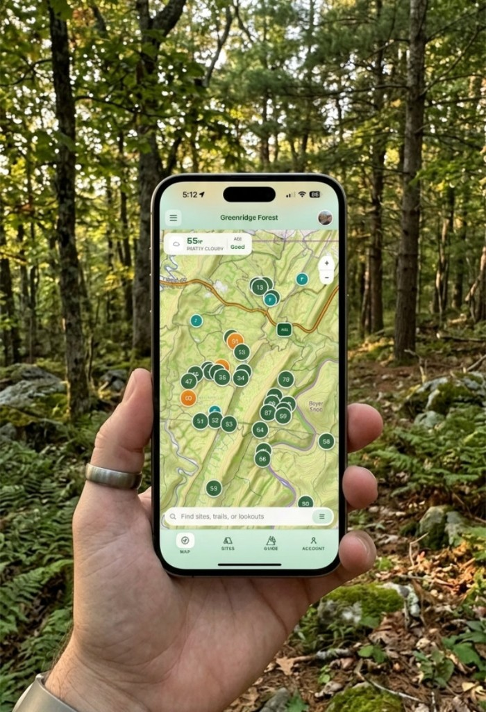
This essay is a build case—Greenridge—not a framework list. Greenridge is a field tool for Green Ridge State Forest: first-come, first-served campsites, ground truth on a paper clipboard at headquarters, spotty cell service, and no reservation API to query. The useful job is not “find an open site.” It is: before you drive, understand what kind of site you are heading toward; after you arrive, see what the board last recorded — with no pretense that the app has authority the forest never gave it.
My first direction looked like every other outdoor product: map, filters, availability language that implied the app knew what was open right now. That would have been false. A wrong green checkmark in the woods is worse than admitting the data is stale.
02 — Staleness
Honest staleness beats fake availability.
The design shift was naming what the app actually does: mirror a snapshot of the board, show how old it is, and stay inside that boundary. “Site 42 is available” trains users to trust a system that does not exist. “Here is what the board looked like two hours ago” is still useful if you are driving in with eyes open—and it matches how campers already reason about primitive sites.
That constraint rewired the whole build. A camper squinting at glare with cold hands gets a vote. So does 3G that drops mid-scroll.
03 — Field
The field deleted what the demo loved.
I shipped working software early — React on the live web, short deploy cycles, fixes from use in the forest instead of from static mocks on a large monitor.
What survived was not the cinematic first builds. Parallax and hero motion read well on a desktop; in the field the work was legibility, battery, and whether someone could act before dark. Refinement was deletion.
One map screen hid slow tile loads behind a polished shell. On a weak connection the shell sometimes never cleared — users stared at loading while the map was ready underneath. The fix was not more animation. Mount the map, show the forest, fetch sites in the background.
Inputs under 16px trigger iOS zoom — found on a phone in a parking lot, fixed the same day. Actions that looked fine in a row were wrong for gloved thumbs; they moved to a grid with larger targets. The bar was never award-worthy UI. It was whether a tired person could use this before dark.
04 — Ritual
This is planning around a ritual, not a platform.
Greenridge is not a reservation product. It is situational awareness around a physical ritual: drive in, read the board, claim a site. The project page goes deep on the vision pipeline, ML loop, and solo build; this essay is only the product-shape argument — why the interface refuses to impersonate systems the domain does not have.
If you are building where authority lives outside your database — logistics boards, ward lists, clipboards at a desk — the test is simple: does the UI promise precision you cannot defend? If yes, you are not reducing risk for users. You are spending their trust early.
Ship the smallest honest behavior. Show what you know, how old it is, and what you do not know. Let the field delete the rest.