The bottleneck
100 first-come campsites across 49,000 acres, little signal, and one paper sheet at headquarters as the only record of who is camping where.
The system
An offline-first guide campers use to plan a trip. Its record comes from public data and photos of the sheet, and every fact shows its source and its age.
The playbook
Put a working build in front of real conditions early, show what the information doesn’t know, and keep a person on anything uncertain.
The presentation
The journeys: one record from research to working screens
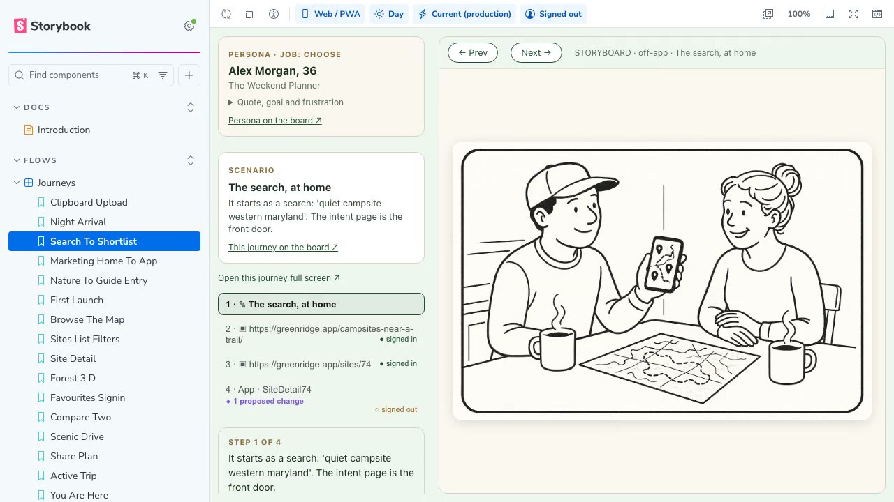
The design work stays attached to the working product. This is the part I most want another designer to inspect.
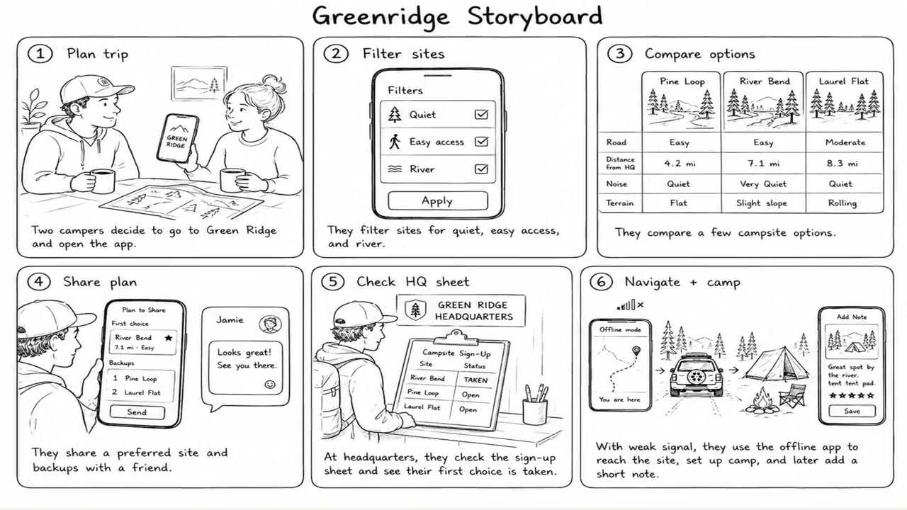
I use Storybook for more than component documentation. It is where I can walk through a user journey, see the current interface, collect feedback on the part of the journey where the issue occurs, and work through a change without losing the original context.
There is a larger reason I work this way. I build with code early because some of the hardest problems in Green Ridge are environmental. Reception disappears. A photograph fails to upload. A map is too heavy for an old device. A site pin turns out to be wrong. A static mockup can help with an interaction, but it cannot tell me whether those conditions have been handled. By keeping the design workspace close to the running product, I can bring actual failures back into the journey instead of documenting an idealized version of how it should work.
02 From feedback to production, inside Storybook · 01 The research and the product direction
I built against the real conditions
Green Ridge started with a map, site information, and an attempt to read the sign-up sheet. It became several connected products.
The first working version went online quickly because I needed to learn whether the idea held up against real handwriting, unreliable signal, and the way campsites are actually distributed across the forest. A polished prototype could not answer those questions.
00 The work behind the app · 12 Designing for no cell service · 08 Designing availability when the information gets old
Understanding a campsite before driving there
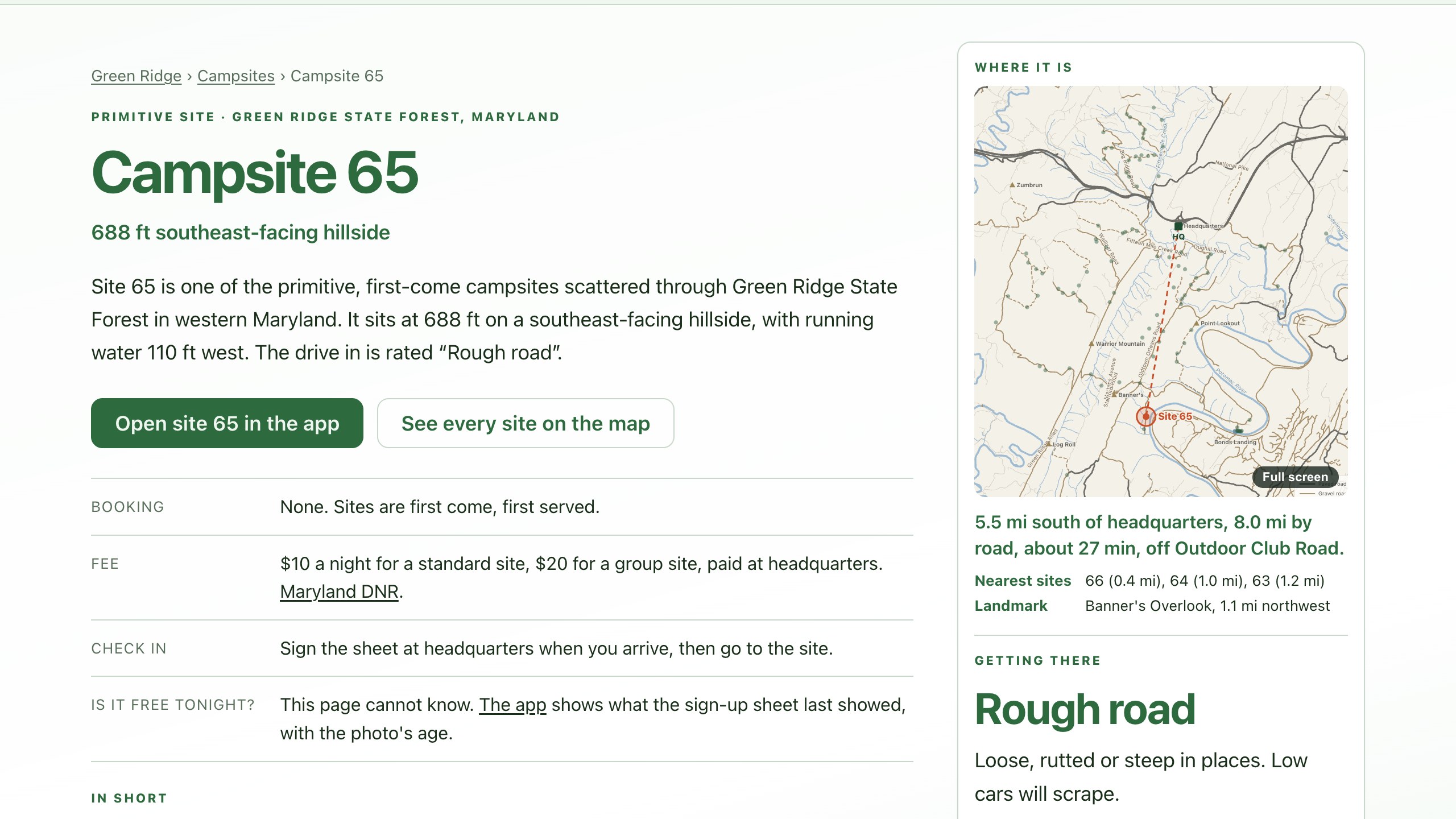
A dot on a flat map is useful for navigation, but it hides the things that make one campsite very different from another.
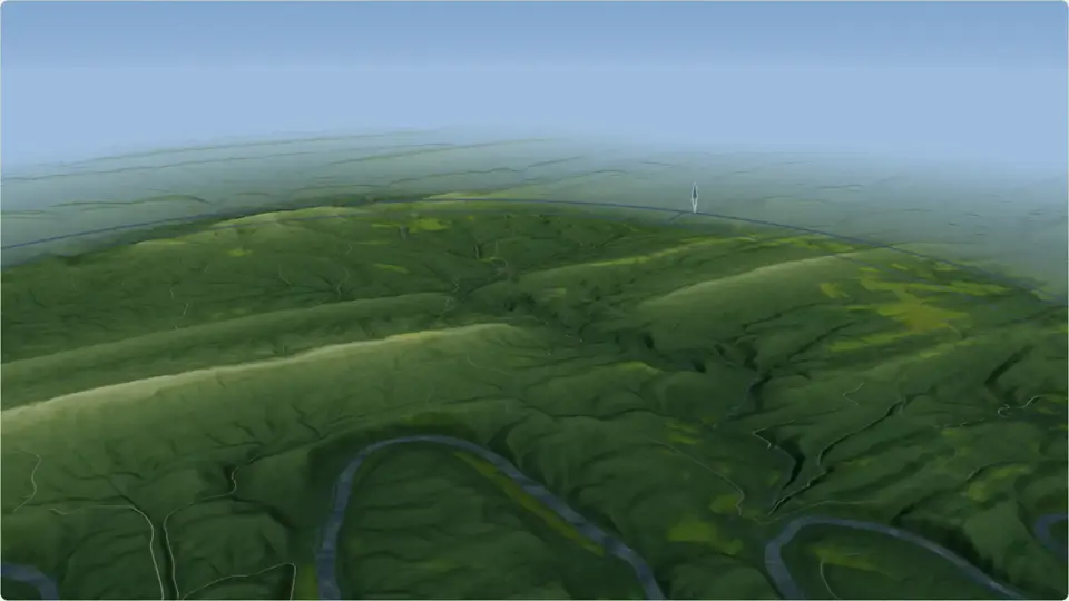
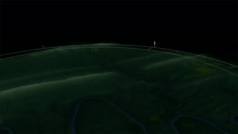
Green Ridge’s campsites are spread across ridges, hollows, river terraces, and long gravel roads. A dot on a flat map is useful for navigation, but it hides the things that make one campsite very different from another. I wanted people to understand the ground before they chose where to sleep.
04 Mapping a forest for different kinds of decisions · 05 Rendering the ground and the sky · 11 Making campsites comparable
Uncertainty stays visible
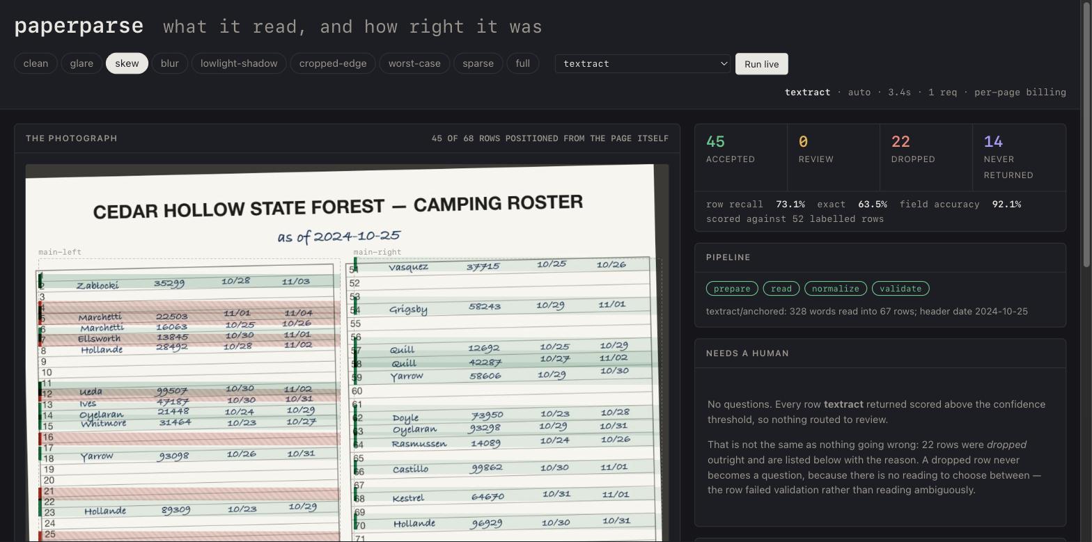
Reading a handwritten sheet without trusting the reader too much.

One photo of the sheet becomes a list of open sites.
It starts at the kiosk. Ahead of the bar it is a photograph; behind it, three columns are rows and two are struck out.
It runs when this tab opens. The sheet is drawn for this page: every real one carries a column of campers’ surnames, so none is published here, but its structure, the twelve block boundaries and the steps are the pipeline’s own. No model runs in your browser, and the reader takes the twelve blocks in its own order rather than top to bottom.
08 Designing availability when the information gets old · 09 Privacy by design · 10 paperparse and the human review system
One system: design stays attached to production
Feedback on a journey step becomes a prototype beside the live page, and a decision.
A replay of one real run. In Storybook, a reviewer walks the Site Locator journey and leaves feedback on a step. That feedback is filed as a GitHub issue, a Claude worker drafts candidates behind a switch, and the candidates come back into the same step beside the page as it runs in production. The owner picks one, the other is closed as superseded, and the approved change ships.
02 From feedback to production, inside Storybook · 17 Testing, releases, and corrections
What happened when people actually used it
The product has to make sense to people who haven’t heard the explanation.
I can learn a lot from my own trips and conversations with campers, but the product has to work for people who don’t know me. That’s why I pay attention to what people do once they find Green Ridge.
The milestone I keep coming back to is a stranger taking a photograph of the paper sign-up sheet at headquarters and submitting it through Green Ridge on their own. It’s a small action, but it asks something of the camper. They have to know the feature exists, decide it is worth using, photograph the sheet, and complete the contribution. What they get back isn’t simply a personal feature. They help make the information more useful to other people heading into the forest.
Search Console exposed a specific kind of intent I hadn’t given its own front door: people were looking for places suitable for meteor showers and viewing the night sky. That wasn’t simply an invitation to write a stargazing article. It was a reason to make sky visibility a campsite-selection criterion and connect the resulting shortlist to the site-level visual experience. The result is the open-sky campsites page and a clearer path from search to a modeled view of the actual skyline from the pitch.
23 What people actually did · 14 The public website, search, and privacy-conscious analytics · 22 Making the forest findable
What generalizes beyond this forest
The Green Ridge app isn’t a business. The pattern travels.
There’s no revenue, retention curve or customer list to cite here: it’s a free guide to one forest. What it does have is an architecture for a common commercial problem. The real record lives on paper, the work happens where the network drops, and a wrong answer costs someone a wasted trip, or worse.
The short version: a deck of the place, the flows and the decisions →