theme/assets/js/home-draft-k.js (paint) · extends 01 Color tokens with the energy-mapping rules the homepage wave field established
Rules: Hero stake #a8dce8 is a peak color, used on italic H1 stakes and the brightest 28% of any animated field, always on ink, never body text, never on paper. Teal light #3d7a8c is the energy mid-tone between accent and stake; on paper surfaces it stays a hover/secondary accent only. Muted #6b6560 carries counterphase (troughs, receding motion) so dark surfaces never need a second cool gray.
Energy ramp: quiet → peak (the wave field’s four bands)
H2 · large fluid 1.25→1.75rem Fraunces serif margin-top: spacing–55
Ground truth lives on a sheet
H3 · medium fluid 1→1.125rem Fraunces serif margin-top: spacing–45
Human review is architecture
Body · medium fluid 1→1.125rem Source Sans 3 · lh 1.55 default prose
No reservation API. The Forest Service runs a first-come signup clipboard at HQ. Overclaiming availability would erode trust faster than no app at all.
Small 0.875rem Source Sans 3 nav · captions · tags
Caption · nav · metadata · byline · badge · tag
Section number .cs-num Section marker on full write-ups the live kicker on /full/ pages
01: The problem
Studio section label .studio-section-label Same metrics as kicker used outside Greenridge scope
At a glance
Fraunces: variable axes
Display serif for claims and headlines. Four axes in one file: optical size, weight, softness, and wonk, the hand-drawn alternate forms that make the voice feel human.
humanirregularityirregularity
A typeface that can read as a quiet editorial serif, until you turn wonk up, and the same letters become handmade, expressive, alive.
WONK 0.00 · watching polish dissolve into hand
Site default: opsz + wght only. This specimen loads SOFT + WONK on /studio-kit/ via Google Fonts variable.
Write-up sections ship on light surfaces only. Production has no dark section variant (cs-section modifiers are --full-width, --full and --side-media), so a dark specimen is not shown.
Kicker + H2 + lead + CTA · light bg
01: The problem
Ground truth lives on a physical sheet
No reservation API. The Forest Service runs a first-come signup clipboard at HQ. Overclaiming availability would erode trust faster than no app at all.
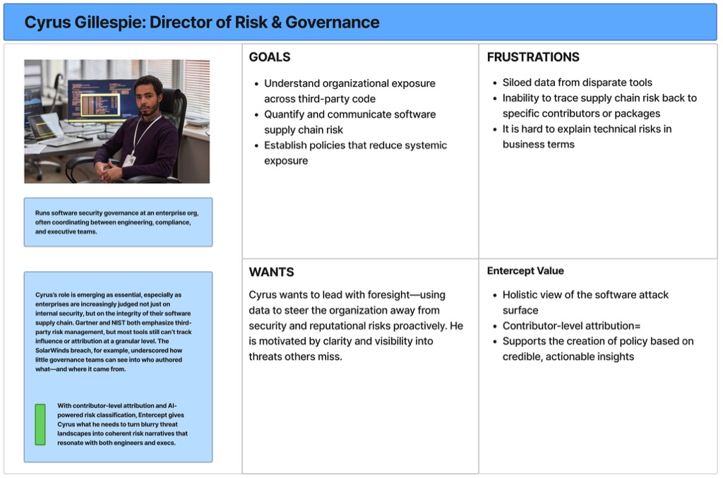
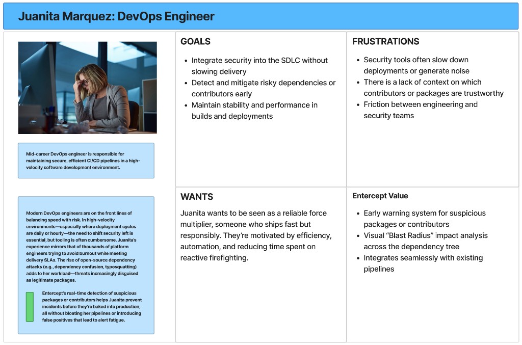
When: §02 Research (or similar), copy left, 2+ persona boards right. Prev/next + dots + lightbox on active slide. Not for full-width persona galleries (use .cs-persona-gallery).
02: Research
Understand the user and the buyer.
Two-column section: narrative left, carousel right. Arrow keys work when the carousel region is focused.
Juanita Marquez: DevOps Engineer
Cyrus: director of risk
1 of 2
06
Pull quote
Uncertainty is not an edge case in the product. Uncertainty is the product condition.
Intent: Enter password inline, no redirect to /full/. Specimen lede from Even G1; PHP renders label Full project on all password bridges.
Password
Full project
BLE takeover architecture, display constraint discovery, Claude Code integration pipeline, display modes, and Mac companion app: seven sections on what it took to replace the phone.
Field research, the pivot from co-pilot to a voice assistant, interaction and voice architecture, human-in-the-loop escalation model, and technical architecture: four sections covering the full incubation arc.
Incorrect. Check the password and try again.
I’ll follow up with access details.
Intent: Password cookie is set (or admin), gate confirms access and offers the CTA without re-entry. Cream gradient mirrors studio-gate--public. Tier reads Unlocked in PHP.
Unlocked
Full write-up
Field research, the pivot from co-pilot to a voice assistant, interaction and voice architecture, human-in-the-loop escalation model, and technical architecture: four sections covering the full incubation arc.
B: Bridge overview · sticky side rail (visual + gate)
Pattern:.bridge-overview__side stacks product visual + gate in a sticky right rail; narrative scrolls in .bridge-overview__left. Password row stacks vertically in the narrow rail. Specimen: Defense supply-chain console copy.
ROLEProduct Direction + MVP
SCOPE0 → Pilot
CONTEXTAerospace & defense logistics
YEARS2024
Most supply chain systems track and report. In aerospace and defense, operators need options, tradeoffs, and consequences filtered by real constraints, not another status feed.
I worked with the founding team to translate deep operational expertise into product direction: decision intelligence built around constraints, viable scenarios, and pilots validated against decisions operators had actually faced.
Password
Full write-up
Architecture, workflow research, and positioning: password protected.
Incorrect. Check the password and try again.
I’ll follow up with access details.
Unlocked
Full write-up
Architecture, workflow research, and positioning: password protected.
Intent: Single unlock entry point on the homepage. Enter the password once and all bridge gates stay open (localStorage). Dismiss (×) hides it for the session only (sessionStorage). Hidden entirely once unlocked via localStorage or when password was entered on any bridge page. Rendered server-side (PHP hidden); homepage-gate.js shows it when neither unlocked nor dismissed. Uses .studio-bridge-gate-rail for content-column alignment (same as hoisted bridge gates) with white background.
Locked: 520px hero + excerpt visible; gate form overlaps bottom of hero band (Option C). Unlocked: same hero; post_password cookie set, so full post-content renders (no .cs-gate). Demo below shows form shell only.
Research wasn’t validation. It was the compass.
Sample unlocked body: first .cs-section after the password cookie is set. Hero and excerpt stay visible above this rail.
Constraint-first build on unfamiliar hardware.
Sample unlocked project detail: approach, stack, and open questions render here after post_password is accepted.
Unlocked: .cs-gate--unlocked · the form stays in the DOM but is inert (pointer-events none, 60% opacity) while the unlocked confirmation replaces the prompt. This is what a returning visitor with a valid cookie sees before the redirect completes.
Error: .cs-gate--error on the request field · red border plus focus ring, applied when the access-request email fails validation. Same panel, field-level only.
09
Phone plate
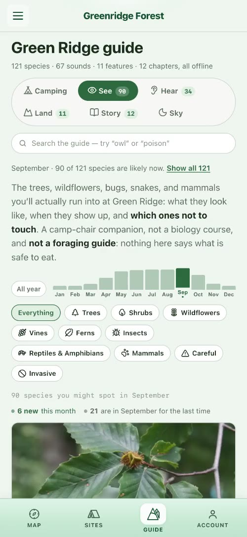
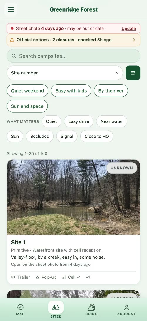
.studio-brief-case__visual–phone · the one phone treatment the site uses: a portrait capture sits on a dark plate over its own blurred frame, sized to its content, with the device’s corner radius (15.2% / 7.3%, circular at any size) on a device capture and a 14px corner on a bare screen recording (the bridges). Scan briefs (brief-scan.css) and the scan bridges (bridge-scan.css). Captures: the current Greenridge guide and shortlist (assets/case-art/greenridge-phone-*.jpg).
STACKReact · Vite PWA · Node · Cognito · Claude · Lightsail
STATUSLive PWA · iterative field hardening
.cs-stack · same component, technical rows
CLIENTVite + React PWA
APINode/Express · Cognito
VISIONClaude multimodal + admin review
DEPLOYLightsail · Capacitor shell
10b
Home hero: letterbox headline (home-alt)
theme/assets/css/home-alt.css · theme/assets/js/home-alt-gsap.js · / (current homepage, templates/front-page.html) · h1.home-alt-hero__claim built from .home-alt-line > .home-alt-word spans; GSAP masks each word on load · layout contract: the headline is display:flow-root and html.home-alt–animate switches the claim to flex-column so mask margins never collapse (the line-two jump fix, brief-console.css carries the same contract for briefs) · static preview below; the animation needs home-alt-gsap.js
Idesignandbuildcomplexproducts.
I go into complicated domains, learn how the work actually happens, and build enough of the real thing to know whether we are right.
10c
Console hero: /work/ and cluster pages
hero-interactive · /work/ + cluster pages (no longer the homepage: / uses the home-alt letterbox above) · min-height capped in kit (production: min(88vh, 920px)) · doors are links to the cluster pages (work-console.js); the hub hero swaps domain clips over the homepage stage (work-hub-hero.js, inc/hub-stage-hero.php)
Principal product design and building, across healthcare, security and government.
The work, from the first question to the shipped product.
Domain doors navigate to the cluster pages from /work/ and cluster pages.
I help teams figure out what to build, then make it real.
I’m Christopher Mullins, a Principal Product Designer working on AI, healthcare, security, and other technically complex products.
12
Work bridge hero
/work/{engagement}/ · hero in page content · .wp-site-blocks > .studio-hero–video · 520px band · cluster-hero__content vertically centered · engagement backdrop template part
Don’t pick a direction. Build the loop.
An AI incubation studio · Governed agents for state services · 2024–2026
13
Full write-up hero
/work/{engagement}/full/ · template hero sibling of <main class="studio-case"> · 520px band · same backdrop + cluster-hero__content · title + excerpt (public lede) · gated: Option C, hero stays 520px; password form overlaps bottom band (studio-gate.css)
Designing the search for product-market fit
The company had real AI capability without a defined wedge. The work was a validation loop across verticals, with a state services app as the flagship pilot.
14
Site header
site-header · rgba(14,26,31,0.96) bg · .site-header__wordmark · white nav via .wp-block-navigation-item__content
theme/templates/archive-podcast.html · hero-band.php · podcast.css · .studio-podcast-landing__hero · 520px band · top-aligned rail (not vertically centered) · the series artwork (180px square, rounded) over a blurred backdrop of the same artwork · series label / h1 / italic tagline / description, all white · subscribe link .studio-podcast-subscribe__link–apple (outlined pill, #a8dce8)
Podcast
Feedback Loupe
The insights are mine. The hosts are not.
An occasional podcast on the frontier where AI, product design, and human creativity collide. Each episode surfaces one idea worth your attention. The hosts are fully AI-generated. The curation is not.
theme/assets/css/podcast.css · .studio-podcast-episode__body · show-notes list · transcript <details> · CTA strip · episode nav · latest episode card · episode archive grid · podcast.css not loaded on design kit page: all demos use dk-pod-* classes
Show notes list: .wp-block-list inside .studio-podcast-episode__body · no-bullet · tabular-nums timestamps in teal · flex rows · bottom borders
0:00 Introduction: what trust means in consequential systems
4:32 Why defaults are policy decisions
12:18 Field research vs. desk research: when to leave the building
21:45 The co-pilot that creates cargo
33:10 Wrap-up: uncertainty as the product condition
Transcript disclosure: .studio-podcast-transcript · <details> · teal uppercase summary + ▸ chevron rotates on open · scrollable body (max-height 60vh, custom scrollbar) · populated from _ssp_transcript_text post meta by render_block filter
Read transcript
Welcome to Feedback Loupe. Today we’re exploring how trust is designed, not earned through marketing, but built into the grain of an interface.
When a clinician sees an AI recommendation, they don’t ask “is this correct?” first. They ask “can I explain this to my patient?” That’s the design constraint most teams miss.
The question isn’t whether the model is accurate. The question is whether the person using it can maintain their own professional judgment while incorporating what the system surfaces.
Contact CTA strip: .studio-podcast-cta · injected by render_block filter via {{studio_podcast_cta}} · Fraunces left / teal link right · flex space-between · border-top divider
Episode nav: .studio-podcast-nav · injected via {{studio_podcast_nav}} · 3-col grid: prev / all episodes / next · empty slot for first/last episode uses span.studio-podcast-nav__link–empty · collapses to 2-col on <600px with “All episodes” on its own row
Latest episode card: .studio-podcast-landing__latest · rendered by podcast-landing.php {{studio_podcast_landing}} · section > latest-inner > latest-row · cover art (120px / 160px @641px+) + Fraunces title (margin-top: 0, flush with cover) + meta + excerpt + <audio controls preload=”metadata”> · cover from episode cover_image meta, falling back to series artwork
Ship real code and let reality grade the idea. For one solo builder, production code is the prototype: feedback comes from the field, not a conference room.
18
Work engagement cards
theme/assets/css/work-engagement-cards.css · .work-engagement-card · video cap (16:9) + paper body · domain-colored top accent bar · used on /work/, clusters, projects hub, podcast related
theme/assets/css/work-domain-doors.css · .work-domain-doors · 3-col paper cards with index, label, claim, meta, CTA · domain-colored top bar · shipped DOM note: on /work/ the doors render inside hero-interactive (.hero-interactive__door / __door-index / __door-label / __door-meta); this standalone .work-domain-doors block is the theme/parts/work-domain-doors.html variant
theme/parts/cluster-console-disciplines.html · same .hero-interactive__door DOM as the shipped console, but the axis is the three disciplines, not domains · doors toggle full-page panels (nothing selected = default panel; re-click or Escape returns; arrows walk) · door
meta line is the discipline’s claim, three words or fewer than six
Do not mix door families on one surface: a page presents domains or disciplines, never both. Incubation company names never appear in door meta.
theme/assets/css/cluster-engagements.css · .cluster-nav · teal outline chips for domain filtering · .cluster-nav__chip–all (filled dark, links to /work/) · .is-current state
25
Work hub toolbar
theme/assets/css/work-hub.css · .work-hub__toolbar · practice filter chips + sort control · /work/ hub · grid variants: .work-hub__grid on /work/, .work-hub__grid–engagements on / and cluster pages
theme/assets/css/prototype-overlay.css · theme/assets/js/prototype-overlay.js · .studio-prototype-overlay · full-screen modal for prototype iframes · dark chrome bar (label + close) · viewport iframe · trigger: .cs-prototype-launch button
Launch button: .cs-prototype-launch · teal fill · inside the write-up body
Overlay panel (static preview): .studio-prototype-overlay__panel · dark chrome bar + viewport area
Greenridge: interactive prototype
iframe viewport: prototype loads here
27
Approach artifact path
theme/assets/css/approach-path.css · theme/assets/js/approach-path.js · the Discover stop carries a Research sub-block (#panel-approach-research, 2026-10-01) · section.approach-path[data-approach-path] (cream band, built by the script from an empty shell) · .pinwrap / .pinband (pins on desktop and tablet; the page scroll moves the rail) · svg.dd (double diamond: strands in Discover and Develop, stages in Deliver) · .now + .strands key + .strand-def · .crail of .card (240px) · lightbox: bridge-lightbox.css shell, instance #approach-path-lightbox · replaced the approach deck (approach-deck.js) in theme 1.11.877
Design is a strategic function, not a service layer.
Behaviour: pins when the viewport is wider than 600px, motion is allowed and the whole band fits the height (1280×720: band 712px); otherwise a swipe rail (.pinwrap without .pinned, hint switches to “Swipe for each artifact”). Tap targets: nearest diagram point within 22px. Card image or video opens the lightbox; arrow keys step through the 14 artworks; closing lands the band on the last one viewed. Caption budget: 5 lines on a card with a two-line title, or the rail grows and 1280×720 stops pinning.
01 Discover · EmpathyThe problem you think you have isn’t always the problem.
DivergentDivergent researchUser researchEmpathy
Spend time where the problem happens, and see it the way the people living it do.
Artifact cards (static preview): .card · 1px top rule (3px accent when .selected) · .kind · h4 serif · .media 16:10 (button.media opens the lightbox; .media.quote sets the claim as type) · .cap · .src
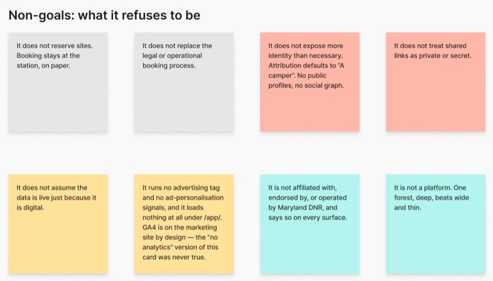
02 · Non-goals
What it refuses to be
⤢ EXPAND
Written before most of the goals: it does not reserve sites or try to be a platform. One forest, deep.
Greenridge · FigJam
03 · Pivots (selected)
Three pivots that changed the product
Browsing was never the hard part.
Pivot 1 of 3: campsite browser to digital mirror
.media.quote: a claim set as type when the artifact is a sentence, not an image.
Greenridge · FigJam
Live: /approach/ (the band is script-built, so it is shown here as static previews). QA: scripts/approach-path-qa.mjs, scripts/approach-path-lightbox-qa.mjs.
theme/assets/css/work-console.css · theme/assets/css/hero-interactive.css · Production: /work/ and the cluster pages render .work-console + .work-console-float via theme/parts/cluster-console-work-hub.html (page-work.html and the cluster templates; the homepage has carried no console since 2026-09-30, and there is no home-console.html part) · cluster theme/parts/cluster-console-*.html (link doors + aria-current) · Legacy hub filter: theme/parts/work-console.html (button/radio, deprecated on /) · .work-console-float > .hero-interactive__console > .hero-interactive__doors
Console shell, doors (inactive): .hero-interactive__console · glass morphism dark container (rgba 10,14,16 + backdrop-filter blur 16px) · .hero-interactive__doors 3-col grid · each door: button[role=”radio”] with data-domain + data-index · index / label / meta flex column
Active door: .is-active + aria-checked=”true” · white bg (–color–base) · dark text · elevated shadow · translateY(-6px) scale(1.02) · door-index inherits contrast at 35% opacity
Cluster console variant: <a> elements (not buttons) · .is-active + aria-current=”page” on current domain · used in theme/parts/cluster-console-healthcare.html etc.
The homepage window: the theme’s static build of the PAI front end (assets/pai-home, built from prototypes/pai-loading by scripts/build-pai-home-window.py), the same code the homepage shows. Reading pane left, chat slab right. Public visitors get the scripted demonstration until they interact; readers with access get the live assistant over the full portfolio.
Live, not a mock: this frame is the production window with the public reel. The glass behind the pane is painted by the host page, so here it sits on the kit’s paper.
31
PAI chat
/chat/ · the React SPA, served by the same backend · conversation column, the pills under the greeting, the composer with the voice button, the model chip and tool dots, the reading pane that opens on the left when the assistant surfaces a page.
Live, not a mock: the production app, opened with the write-up’s context. Voice states (idle, connecting, listening, processing, muted, error) are the button’s own; press it to see them.
32
PAI reading pane
What a site page looks like inside the pane: the embed view (?pai_embed=1 · body.pai-embed) strips the site chrome, keeps the content rail, and the page’s own components adapt (the About timeline turns vertical, the approach diagram’s trace bar sticks). Desktop: the pane is the window’s left column. Phones: a sheet.
33
PAI conversation voice + tone
Written register for PAI’s conversational output · source: backend communication-style-guide.service.js · condensed rules injected after first turn · error copy approach · TTS/STT infrastructure reference
Context: PAI represents Chris directly in real-time conversation. Register is conversational but not casual: engaged and knowledgeable without performing warmth or slipping into chatbot patterns. TTS output puts a premium on sentence economy: everything the assistant writes will be read aloud.
Core rules with examples
1–2 sentences per turn. Voice-friendly.
TTS reads everything aloud. No paragraphs, no bullet lists: they become unbearable to hear.
Do
The clinical voice assistant was a voice AI for community health workers: the core challenge was documentation burden in the field.
Don’t
Great question! The clinical voice assistant was a voice AI product designed to help community health workers with their documentation workflow. Here are some key aspects of the project: • Research-driven approach • Field validation • Iterative design process
Specific, not generic. Anchor to what they just said.
If the response could apply to any question from any visitor, rewrite it. “I’d be happy to help,” “great question,” “that’s interesting” are all signals to revise.
Do
The healthcare work is all high-stakes environments: the AI can’t just be useful, it has to be trustworthy to the clinicians using it.
Don’t
Great question! I’d be happy to tell you about Chris’s healthcare work. He has done a lot of interesting work in this space that you might find very valuable to learn about.
Dialogue, not interrogation. One ask per turn, or none.
Not every reply needs a question. Observations and invitations work. Never stack two questions in one turn.
Do
The Amtrak work was design system and booking flow: quite different from the AI products. Worth exploring if information architecture is what you’re looking at.
Don’t
Would you like to know more about the Amtrak project? What aspects are you most interested in? Are you looking at the design system work or more the UX research side?
No scripted acknowledgments.
Avoid: “Got it,” “Perfect,” “Thanks for sharing,” “No problem,” “No worries.” If you need to acknowledge, make it specific to what they said, not a filler phrase.
Do
Security-focused work is a different mode: classified context means most of what makes it interesting can’t be public. The cluster page has what can be said.
Don’t
Got it! That makes sense. No problem. I completely understand that you’re interested in the security work. Thanks so much for sharing that with me.
Error + edge case copy: same register as the rest of the conversation. Brief, matter-of-fact, no apology loops. Voice output makes over-apologetic errors especially grating.
Voice unavailable
Voice input isn’t available right now: type your question and it’ll work the same way.
Out of scope
That’s outside what I know: I’m focused on Chris’s work and background. Anything else I can help with?
Connection error
Couldn’t reach the server: worth a retry in a moment.
Gated content
The full write-up is password-protected: I can help you get access if you’d like.
Voice: speech in and out run through the backend’s speech routes behind the microphone button in the frames above; vendors and limits live in the PAI repository, not here.
35
Application brief console
theme/assets/css/brief-console.css (39KB) · theme/assets/css/application-brief.css · parsed by theme/inc/application-brief.php · /brief/{token}/ pages · binding standard: docs/BRIEF_CRITERIA.md · hero = eyebrow + letterbox headline + fit only (layout: console, contents/proof: none) · structural contract: .studio-brief-console-spacer div REQUIRED after the strip closes, or the closer buries under the strip hang · demos below use the shipped DOM with kit-scope styling (.dk-brief-demo); production styles are body-scoped to .studio-application-brief.studio-brief-console
Work cell: article.studio-brief-case · plate (video or /studio-embed/ capture, optional –phone frame) + kicker (__domain, an imperative doctrine line) + claim title + facts dl (Role / Decision / Outcome, Decision bold via nth-child(2)) + optional __fact–signal row (funding and recognition, separated from outcomes) + named CTA (never “Open the full write-up”)
AI security operations center · priority threats, investigation in the feed
Closer: aside.studio-brief-next on the ink panel · portrait + Selected work label + claim (upright serif, em italic) + lede (inline links carry their own light color) + actions: mailto primary · –secondary portfolio link · __addr line
36
Coverage index: families not demoed above
Component families live on the site without a kit demo yet. Source files are authoritative; this index keeps the kit honest about its own coverage.
View transitions: studio-nav-vt-* page-transition system · site-wide
Mobile console layout: mobile-nav, is-menu-open · inc/mobile-console-layout.php
Staging-only: Activity dock (vm-dock, docs/VISIT_LIVE_MEMORY.md) · Brief Activity (studio-brief-activity) · home drafts (hd-*) · staging-only draft pages · not on production by host gate